Thursday, December 13, 2007

Final Project


----------------------------------------------------------------------------------------

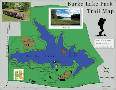
Here are some links that relate to my map.


Fairfax County's Burke Lake Park Web site.
American hiking Society website They voted Burke Lake one of the tope ten fitness trails within 10 miles of a major Urban area.

http://potomacappalachian.org/
The Potomac Appalachian Trail Club is the regional club for the Appalachian Trail (AT.)

http://www.appalachiantrail.org/site/c.jkLXJ8MQKtH/b.1423119/k.BEA0/Home.htm
The Appalachian Trail web site speaks for itself!

http://www.fairfaxcounty.gov/maps/map.htm
I got some of my data from the Fairfax County GIS department, but with LOTS of editing!

Friday, December 7, 2007

Maps found on internet.....Extra Credit


https://blogger.googleusercontent.com/img/b/R29vZ2xl/AVvXsEi4hFMSP9CV8uROHkVdz-4uf09JloAnAwb_5ddwjDQyWEgc8UXV9897I1M_dNg8uQy-7001Vvg5tt_eXjz9F2kAVb14Zm7eoFuR3EYjbyOa7n39T2qtbSMQMHmovR_-6CKYFymKTinrjyY/s1600-h/world_language_map.jpg

I like the topic and the colors of this map. What this map doesn't show is what languages are most spoken, it looks like this is of predominant language in certain countries. Chinese is the language spoken by the most number of people in the world.
-------------------------------------------------------------------------------------------


https://blogger.googleusercontent.com/img/b/R29vZ2xl/AVvXsEghazlXpBudr2c9qbL44Y_EeGYwu_GEQCLKFEruDfTlJYv5GEs80od07Al5kOK7AJPrqFTugKYC6cCMaKK64ZpBq8Cpr4sPqGBZnSWj1FIWocnhyphenhyphenfdVFGrxzWA7epUYUFTGerkER9oxL0k/s1600-h/prismmap.gif


This one also has really good colors and is also a prism map. Although I am not sure what the actual variable was.
---------------------------------------------------------------------------------------------


https://blogger.googleusercontent.com/img/b/R29vZ2xl/AVvXsEhNQqn0_uj7vYFz-12NE5RTnPqQCJXVKk8XmvaZCZkuXP0eDBN5gdY51Av27A93MDq0neGevxZ9JU7NpTpYYVwuKBjSJZFnCBJDjAn1VkeAnOL0Evo-bMcEVkTGmfx5rPr6en0Z7ugwfKE/s1600-h/GFZ-Potsdam-PR-20030122-Geoid-Undulation-1250x1250.jpg

This bumpy geoid is really, really cool. It is supposedly an accurate depiction of the Earth's surface. It is amazing to me that we can figure out things like the surface of the Earth and actually travel in space!

-----------------------------------------------------------------------------------

https://blogger.googleusercontent.com/img/b/R29vZ2xl/AVvXsEj1olrLeqcmk27dJN8CCZPp8u7STTFEGWX5vrxtbxgYKUYIBT8XlyiV3_DBwLicBiZAjqlQYfkp4Yf6oFpCD8o5IKn2TaqEjJ7inavEyKEj25Imabb_JfajMtIzhYfieyuGhO7gXGh17bQ/s1600-h/mississippi.jpg

This map uses colors really well to depict the history of the river channels of the Mississippi.

-----------------------------------------------------------------------------------------------

Classmate originals.......Extra Credit


https://blogger.googleusercontent.com/img/b/R29vZ2xl/AVvXsEiclpdB5HdWpBjny4LTnTxI4i7ctRsGuO72I3UN7r0vnezm6FA-KJtDsbSNDOemaz6SIv_Ad1P5vpZxpVaTjcBZm4kHlyZApNghtY1zvEhPmgfc8N6NVWl8xY2p_1S2mwiFPxvbqYW3x_Q/s1600-h/Lab9.jpg

I liked Kevin's green colorramp...I was not so succesful in producing a pretty green. He was one of the first I saw to use rounded rectangles and the gradient looks good too.

----------------------------------------------------------------------------------------------

I really liked the gradient on these circular symbols on Joshua's map. It allowed for viewing of the color of the counties and that was a big problem that I had on my bivariate map.
------------------------------------------------------------------------------------------------

I just absolutely HAD to choose Aaron's map because of those crazy roller skating cows! Take that Professor Leslie ;-)
------------------------------------------------------------------------------------------------

Unfortunately, YES...I chose another of Aaron's map. (Don't go getting a big ego, Aaron!)
I think the background dollar bill is a really neat idea. Color ramp is okay but the dollar signs needing, just a little something extra.


--------------------------------------------------------------------------------------------


Last but not least...I had to give Ashley a shout out....since she liked my outhouses! Seriously, I like the corn symbology on her map....I wonder how long it took to make them?

Tuesday, November 27, 2007

Lab 10...Finally DONE!

I don't have time to chat about it...will discuss it later today ;-)

Thursday, November 15, 2007

Lab 9; Color YEAH!!

I also used Green like Aaron due to the military nature of the topic: Vet population. However, I stuck with the ColorBrewer colors due to my lack of creative ability :-) I made a few changes with stoke width and changed the colors of my Hawaii and Alaska outline boxes. I liked the rounded edges and colors/symbology that other students have used and wish I could learn Illustrator quicker and know how to do them.

The colors looked good between the printed and the JPG, however I would have made the lightest shade green a little darker. It is easier to see the class differences in the color version. However, neighboring states affect how you see the shades. Utah and Texas are the same, but Utah looks darker due to the darker neighboring states.

Thursday, November 8, 2007

Lab 8...Those darn dots!!!

Here is the dreaded dot map! It didn't print out as dark as it looks in Illustrator or here in my JPG......

Friday, November 2, 2007

Proportional Symbol Map


I was not sure if my Chernoff Face map counted as my Proportional symbol post. So here's one from the CDC on cases of flu that is not susceptible to penicillin.

I am noticing things from class like this map doesn't have a neatline and bad figure-ground. I probably would have noticed it before, but not been able to use the proper terms.

Dot Density Map


I had trouble finding dot density maps...Google search didn't get me very far.
I found this dot density map at the USDA web site at the following link:


I thought it was interesting because it shows two colors of dots to depict the changes in the number of cows. Blue for increase and Red for decrease. The quality is not the best...bad figure-ground because it is too washed out. I had to save the PDF and convert to JPG.

Lab 7 Proportional Symbol


Here's my version of the Maryland housing proportional symbol map. My original had a very light gray background...I was trying to get a good figure-ground contrast. But when printing in grayscale it didn't turn out, so I put it back to white.
I had fun creating my outhouse icon ;-) However, I do realize I forgot the scale...as Homer Simpson would say..."D'ohh!"


Thursday, October 25, 2007

Chernoff Faces Map of Health Issues in Chicago


I found this chernoff faces map at the following link. It turned out really light in this JPG...I suggest you go to the web site and see it for yourself!

https://mywebspace.wisc.edu/jprzybylowsk/web/portfolio2.swf


Lab 6 Choropleth Maps


I chose to do one on the Percentage of the Population who were veterans. I did equal intervals and quantiles. My grayscales look better in Illustrator and printed out really dark.


Saturday, October 20, 2007

another choropleth map...


The title says it all....pretty sad!
AP IMPACT: Sexual Misconduct Plagues US Schools: AP Finds 2,500 Teachers Punished in 5 Years

Monday, October 15, 2007

Lab 5 Tri-State Area


Here it is...not too happy with the results....but it is done!

Sunday, October 14, 2007

Choropleth map of Languages


I fund this cholorpleth map of the languages spoken around the world at the following link


Thursday, October 4, 2007

Lab4

This is it...'nuff said!

Monday, October 1, 2007

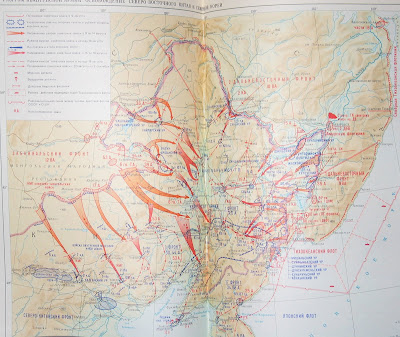
Russian military map

Note sure how this image will show up. It is a Russian map for invasion of Korea. The fonts are interesting for several reasons, first they are in Cyrillic, also they use different shades of blue for bays versus the actual ocean. Also different sizes and shades of lettering depict different things.

Finally for all the military buffs. The US has always used blue for friendly forces (Us and Allies) and red for enemy forces (USSR during the Cold War). As you will see the Soviet Union used red to represent themselves! The big red arrows are to show the path that the forces would take.

Tuesday, September 25, 2007

Lab#3 Mollweide Projection


Well here's my Mollweide Projection jpg for Lab#3. I had the most trouble with erasing the dangling lines....but now that I know how to do that, it will help me re-do my lab from GEOG 110!!

The Mecca Projection aka Craig retroazimuthal


Even though Wikipedia is not an authoritative source, I thought it had an excellent page with colored pictures of projections. I chose this one because I thought it had a cool name and then once I saw it's history and purpose, I really think it's cool.

Included is the text of the page from Wikipedia and the link below. It even gives the mathematical formula for the projection....uggh, I hate math!


http://en.wikipedia.org/wiki/Craig_retroazimuthal_projection

------------------------------------------------------------------------------------------
The Craig retroazimuthal map projection was created by James Ireland Craig in 1909. It is a cylindrical projection preserving the direction from any place to another, predetermined place while avoiding some of the bizarre distortion of the Hammer retroazimuthal projection. It is sometimes known as the Mecca projection because Craig, who'd worked in Egypt as a cartographer, created it to help Muslims find their qibla.

Tuesday, September 18, 2007

Lab #2


Monday, September 17, 2007

my photo

I am posting a photo looking out from Stony Man Mtn in the Shenandoah National Park. I loveto hike and instead of a pic of me, you can see colorful fall leaves.


Monday, September 10, 2007

my links

Here are the three links that I have chosen. I hope no one else has these on their pages.

This one is the Library of Congress' Map Reading Room it is pretty cool to see the collection of digital and historical paper maps that they have. The site also has educational items such as the illustrated guide to maps and geography.

This next link is a hisory of mapping from the British Library. If you follow the links within the web page, you will learn a lot about the use of maps for wars, how maps "lie" and it has a cool Chinese Globe from 1623.

The third link is from an antique map seller called The Old Map Gallery located in Denver, Colorado. It may not be as educational as the other two links, but I like looking at old maps and thought this site was more fun than the other two.....enjoy! This site really showcases the point that Cartography is half ART..some of these old maps are really interesting and creative.

Hope you all enjoy my post...I look forward to seeing what other people have on their blogs.